Video Stories
The VideoStories component is a vertical, stories-style player for a sequence of self-hosted videos
(MP4, HLS, DASH) — the Instagram/WhatsApp stories pattern. It renders inline as a compact 9:16 card that
can be expanded into a fullscreen overlay, with a segmented progress bar, tap navigation, hold-to-pause
and a mute toggle.
Unlike Video , which plays a single video, VideoStories
owns a playlist: it advances between stories on its own, entirely on the storefront, without a round
trip to your app.
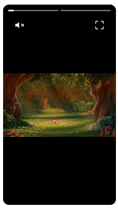
The chrome is drawn by the component itself: one progress segment per story along the top, the mute toggle on the left and the expand button on the right.
Lazy loading
Usage
Pass an ordered list of stories through items. Each item is a video src with an optional poster
image shown before playback starts.
import type { NubeSDK } from "@tiendanube/nube-sdk-types";
import { VideoStories } from "@tiendanube/nube-sdk-jsx";

function MyComponent() {
  return (
    <VideoStories
      width={220}
      items={[
        {
          src: "https://cdn.example.com/story-1.mp4",
          poster: "https://cdn.example.com/story-1.jpg",
        },
        {
          src: "https://cdn.example.com/story-2.mp4",
          poster: "https://cdn.example.com/story-2.jpg",
        },
      ]}
    />
  );
}

export function App(nube: NubeSDK) {
  nube.render("after_product_description", <MyComponent />);
}
Source URLs
Inline card and fullscreen overlay
The component has two presentations, and only one of them is playing at any time:
- Inline card — a 9:16 card rendered in the flow of the slot, sized by
width. It autoplays muted, but only while at least half of the card is on screen, so several stories on the same page don't all start decoding at once. - Fullscreen overlay — opened with the expand button in the corner of the card. It covers the viewport, locks page scrolling, and is closed with the close button or the Esc key.
Tapping the video itself does not open the overlay — only the expand button does, which keeps side taps free for navigation. Playback is carried across the transition: expanding resumes at the moment the inline card had reached, and closing resumes the card where the overlay left off.
Playback options
<VideoStories
  items={items}
  width="100%"
  startMuted
  autoAdvance
  loop
/>
startMuted(defaulttrue) — starts muted, as browsers require for autoplay. The viewer can unmute with the mute button, and that choice is kept as the playlist advances.autoAdvance(defaulttrue) — moves to the next story when the current one ends. Withfalse, playback stops on the last frame of each story and only explicit navigation moves on: a side tap (whentapToNavigateis on) or, in the fullscreen overlay, the ← and → keys.loop(defaultfalse) — restarts from the first story after the last one instead of finishing. It only has an effect together withautoAdvance.
When the playlist reaches the end and loop is false, the component emits onComplete, closes the
overlay if it was open, rewinds to the first story and holds it paused — so it neither loops nor sits on
a frozen final frame. The next interaction (expanding or a navigation tap) starts it again from the top.
Navigation and gestures
- Tap navigation (
tapToNavigate, defaulttrue) — tapping the left third goes to the previous story, the right third to the next one. Works both inline and fullscreen. - Hold to pause (
pauseOnHold, defaulttrue) — pressing and holding pauses the story; releasing resumes it. A hold never also navigates. - Keyboard — while the overlay is open, ← and → move between stories andEsc closes it. Arrow keys are ignored while a form control is focused.
- Progress bar — one segment per story, with the active segment filling as the story plays.
Overlay content
Children passed to VideoStories are rendered as an overlay on top of the active story, in both the
inline card and the fullscreen overlay. This is where calls to action, captions or product links go.
<VideoStories items={items} width={220}>
  <Text style={{ position: "absolute", bottom: "24px", left: "12px", color: "#fff" }}>
    Shop the look
  </Text>
</VideoStories>
Style overlay children inline
Events
Every handler receives an object with type, the current SDK state, and a value payload. These events
are observe-only: they report what the player did and never gate or alter playback.
| Event | value payload | Description |
|---|---|---|
onOpen | { index: number, total: number } | Fired when the fullscreen overlay opens, with the active story and playlist size. |
onClose | { index: number } | Fired when the fullscreen overlay closes. |
onChange | { index: number } | Fired when the active story changes, by auto-advance or by navigation. |
onComplete | { total: number } | Fired when the playlist moves past the last story (never fired when loop is true). |
onError | { index: number } | Fired when a story fails to load or play. |
<VideoStories
  items={items}
  onOpen={({ value }) => console.log(`opened at ${value.index} of ${value.total}`)}
  onChange={({ value }) => console.log("now showing", value.index)}
  onClose={({ value }) => console.log("closed at", value.index)}
  onComplete={({ value }) => console.log(`watched all ${value.total} stories`)}
  onError={({ value }) => console.error("story failed:", value.index)}
/>
When a story fails and autoAdvance is on, the player skips to the next one after emitting onError. If
every remaining source is broken it stops advancing instead of cycling through the playlist forever.
Properties
| Property | Type | Required | Description |
|---|---|---|---|
| items | VideoStoriesItem[] | Yes | The ordered playlist. Each item is { src, poster? } with absolute HTTPS URLs. |
| width | number | string | No | Width of the inline 9:16 card (e.g. 220, "100%"). Defaults to "100%". |
| startMuted | boolean | No | Start muted. Defaults to true, as required by browser autoplay policies. |
| autoAdvance | boolean | No | Advance to the next story when the current one ends. Defaults to true. |
| loop | boolean | No | Restart from the first story after the last one. Defaults to false. |
| tapToNavigate | boolean | No | Tap the left/right thirds to change story. Defaults to true. |
| pauseOnHold | boolean | No | Press and hold to pause, release to resume. Defaults to true. |
| children | NubeChildrenComponent | No | Overlay content rendered on top of the active story. |
| onOpen | (event) => void | No | Called when the fullscreen overlay opens. |
| onClose | (event) => void | No | Called when the fullscreen overlay closes. |
| onChange | (event) => void | No | Called when the active story changes. |
| onComplete | (event) => void | No | Called when the last story finishes. |
| onError | (event) => void | No | Called when a story fails to load or play. |
| style | StyleSheet | No | Custom styles for the inline card container. |
| id | string | No | Optional unique identifier for the component. |
VideoStoriesItem
| Property | Type | Required | Description |
|---|---|---|---|
| src | string | Yes | Absolute HTTPS URL of an MP4, HLS (.m3u8) or DASH (.mpd) video. |
| poster | string | No | Absolute HTTPS URL of a poster image shown before playback. |
Help us improve NubeSDK
Found an issue or have a suggestion? Let us know on GitHub.