Select
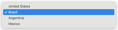
A select represents a dropdown input element that allows users to choose from a predefined list of options.
It supports properties such as name, label, options, value, disabled, and the onChange event handler.

Usage
Example
import type { NubeSDK } from "@tiendanube/nube-sdk-types";
import { Box, Select } from "@tiendanube/nube-sdk-jsx";

function MyComponent() {
  return (
    <Box>
      <Select
        name="country"
        label="Country"
        value="br"
        options={[
          { value: "us", label: "United States" },
          { value: "br", label: "Brazil" },
          { value: "ar", label: "Argentina" },
          { value: "mx", label: "Mexico" },
        ]}
        onChange={() => {}}
      />
    </Box>
  );
}

export function App(nube: NubeSDK) {
  nube.send("ui:slot:set", () => ({
    ui: {
      slots: {
        after_line_items: <MyComponent />,
      },
    },
  }));
}
Event Handlers
The select component supports an event handler that receives an object with the following properties:
onChange: (data: {
  type: "change";       // The type of event
  state: NubeSDKState;  // The current state of the SDK
  value?: string;       // The new selected value
}) => void
Example usage:
Select with onChange handler
import type {
  NubeSDK,
  NubeComponentSelectEventHandler,
} from "@tiendanube/nube-sdk-types";
import { Select, Box, Text } from "@tiendanube/nube-sdk-jsx";

function MyComponent(nube: NubeSDK) {
  const handleChange: NubeComponentSelectEventHandler = (event) => {
    // event.type is "change"
    // event.value may be string | undefined — use nullish coalescing to provide a default
    // event.state is the full NubeSDKState
    const selectedValue = event.value ?? "";

    console.log("Selected country:", selectedValue);
  };

  return (
    <Box direction="col" gap={12}>
      <Text modifiers={["bold"]}>Shipping Destination</Text>

      <Select
        name="country"
        label="Country"
        value="br"
        options={[
          { value: "us", label: "United States" },
          { value: "br", label: "Brazil" },
          { value: "ar", label: "Argentina" },
          { value: "mx", label: "Mexico" },
        ]}
        onChange={handleChange}
      />
    </Box>
  );
}

export function App(nube: NubeSDK) {
  nube.send("ui:slot:set", () => ({
    ui: {
      slots: {
        after_line_items: MyComponent(nube),
      },
    },
  }));
}
SelectOption Type
Each option in the options array should follow this structure:
type SelectOption = {
  value: string; // The value that will be submitted with the form
  label: string; // The text displayed to the user
  disabled?: boolean; // Whether this option cannot be selected
};
Disabled States
There are two independent ways to disable selection:
disabledon the select itself: the whole dropdown becomes non-interactive and does not emitchangeevents.disabledon an individual option: the option is still listed but cannot be selected, while the rest of the options remain available.
Select with disabled options
<Select
  name="country"
  label="Country"
  disabled={false}
  value="br"
  options={[
    { value: "us", label: "United States", disabled: true },
    { value: "br", label: "Brazil" },
    { value: "ar", label: "Argentina", disabled: true },
    { value: "mx", label: "Mexico" },
  ]}
  onChange={() => {}}
/>
Properties
| Property | Type | Required | Description |
|---|---|---|---|
| name | string | Yes | The name of the select, used to identify it in forms. |
| label | string | Yes | The label text displayed above the select. |
| options | SelectOption[] | Yes | Array of options available for selection. Each option can be individually disabled. |
| value | string | No | The current selected value of the select. |
| disabled | boolean | No | Whether the whole select is disabled and cannot be interacted with. |
| style | StyleSheet | No | Custom styles for the select. |
| onChange | NubeComponentSelectEventHandler | No | Function called when the selected value changes. |
Help us improve NubeSDK
Found an issue or have a suggestion? Let us know on GitHub.