UI Slots
UI slots are containers for UI components. When you want to add a UI component, you need to specify their location on the screen, and to support the widest range of themes and layouts, we created predefined slots that are available across all templates that can be used to put your UI components inside.
You can render components into these slots using the nube.render() method and clear them using nube.clearSlot(). For more information, see Script Structure .
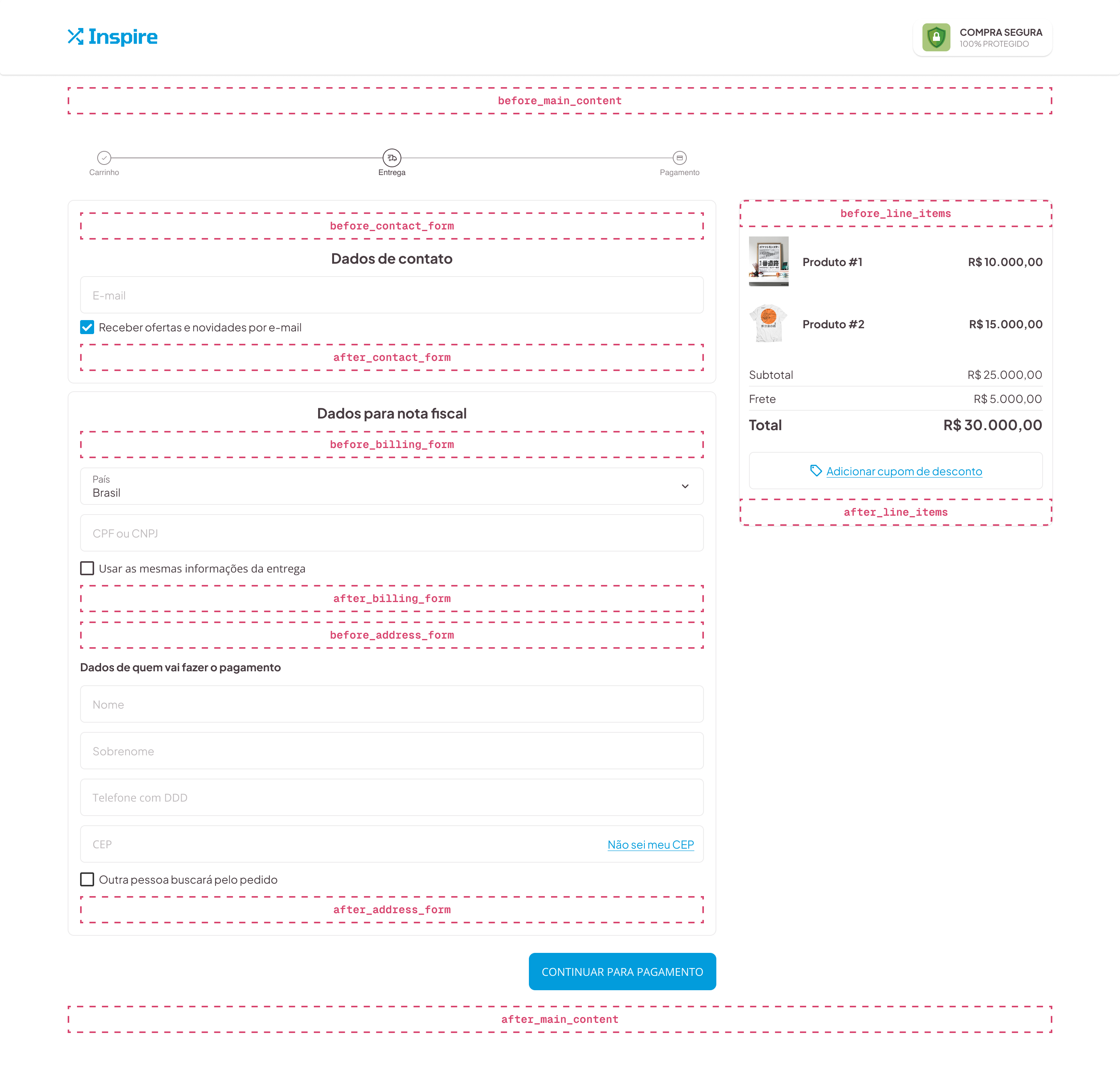
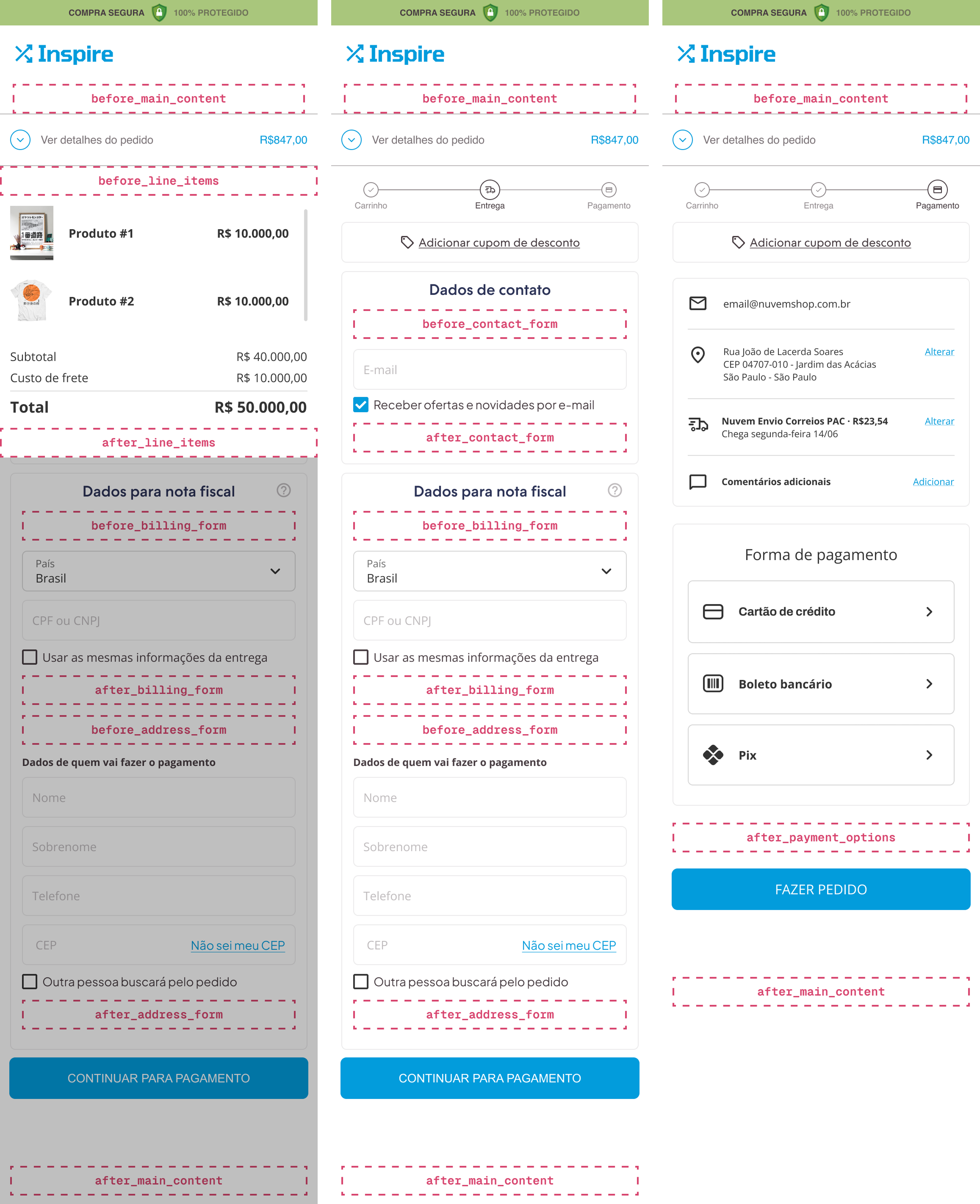
Checkout Slots
These are the slots that are available in checkout:
| Slot | Page |
|---|---|
| before_main_content | start, payment |
| after_main_content | start, payment |
| after_line_items_price | start, payment |
| before_line_items | start |
| after_line_items | start, payment |
| after_contact_form | start |
| after_address_form | start |
| after_billing_form | start |
| after_payment_options | payment |
| before_payment_options | payment |
| before_address_form | start |
| before_billing_form | start |
| before_contact_form | start |
| before_shipping_form | start |
| after_shipping_form | start |
| after_shipping_description | start |
This is their usual location:
Shipping Options slot
The after_shipping_description slot allows you to add custom content after the shipping method description in the checkout page.
import type { NubeSDK } from "@tiendanube/nube-sdk-types";
import { Text } from "@tiendanube/nube-sdk-jsx";

export function App(nube: NubeSDK) {
    nube.render("after_shipping_description", [
        <Text key="ne-correios-pac">This is a custom shipping description</Text>,
    ]);
}
And this is their usual location on mobile devices:
Storefront Slots
Storefront apps built with NubeSDK are supported only when the store is using the Patagonia theme. For all other themes, you must use the legacy storefront app model.
| Slot | Page |
|---|---|
| before_main_content | home, product, category, search |
| before_quick_buy_add_to_cart | home, category, search |
| after_product_grid_item_name | home, category, search |
| product_grid_item_image_top_left | home, product, category, search |
| product_grid_item_image_top_right | home, product, category, search |
| product_grid_item_image_bottom_left | home, product, category, search |
| product_grid_item_image_bottom_right | home, product, category, search |
| before_start_checkout_button | home, product, category, search |
| after_product_detail_name | product |
| before_product_detail_add_to_cart | product |
| after_product_detail_add_to_cart | product |
Product grid slots
To render components in product grids, return an array of components where the root element for each product includes the key prop set to that product's ID. This allows your app to render components across multiple items in the grid.
The example below renders a button on every product card in the grid.
nube.render("product_grid_item_image_bottom_right", ({ location }) => {
  return location.page.products.map(product => (
    <Box key={product.id}>
      <Button onClick={() => console.log(product)}>
        Click Me!
      </Button>
    </Box>
  ));
});
Fixed Slots
| Slot |
|---|
| corner_top_left |
| corner_top_right |
| corner_bottom_left |
| corner_bottom_right |
| modal_content |
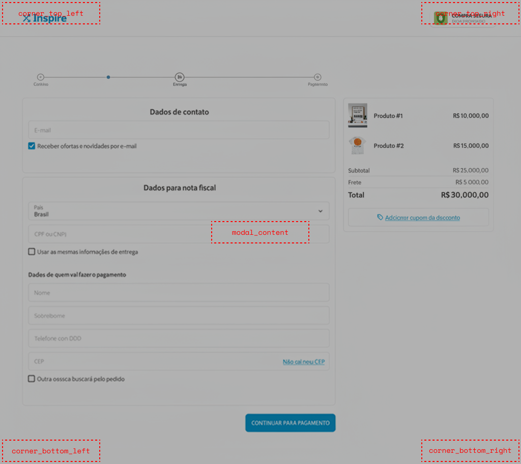
modal_content behavior
Any content rendered into the modal_content slot is displayed inside a dialog. When opened, the dialog adds a transparent backdrop to the page.
nube.render("modal_content", <Text>modal_content</Text>);
The dialog opens only when the slot has valid content. It can be closed by the customer by clicking the backdrop or pressing the Esc key. Clearing the slot will also close the dialog:
nube.clearSlot("modal_content")
When the dialog closes by the customer or programmatically the SDK dispatches the custom:modal:close event:
nube.on("custom:modal:close", () => {
  // handle cleanup or state updates
});