Storefront Slots
Storefront slots are containers available in the storefront pages where you can render your UI components. These slots allow you to customize the shopping experience across different pages.
Theme Compatibility
Available Slots
These are the slots that are available in the storefront:
| Slot | Page |
|---|---|
| before_main_content | home, product, category, search |
| after_header | home, product, category, search, cart |
| drawer_left | home, product, category, search, cart |
| drawer_right | home, product, category, search, cart |
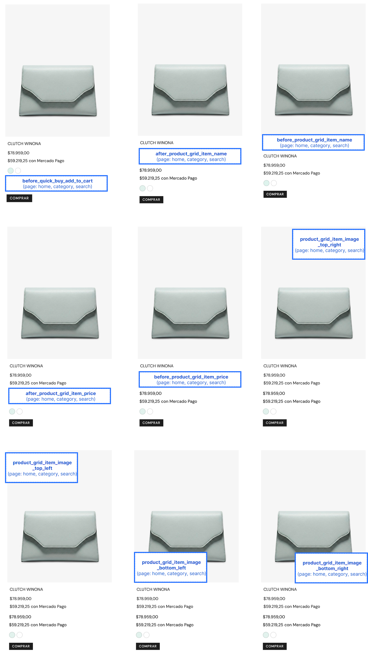
| before_quick_buy_add_to_cart | home, category, search |
| before_product_grid_item_name | home, category, search |
| after_product_grid_item_name | home, category, search |
| before_product_grid_item_price | home, category, search |
| after_product_grid_item_price | home, category, search |
| product_grid_item_image_top_left | home, product, category, search |
| product_grid_item_image_top_right | home, product, category, search |
| product_grid_item_image_bottom_left | home, product, category, search |
| product_grid_item_image_bottom_right | home, product, category, search |
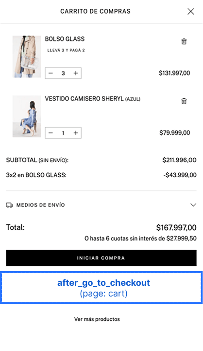
| before_go_to_checkout | home, product, category, search |
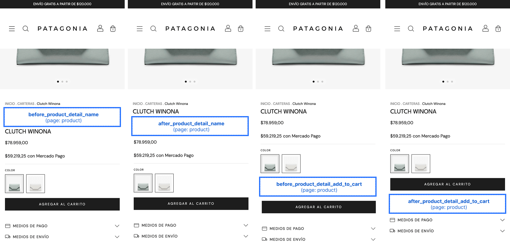
| before_product_detail_name | product |
| after_product_detail_name | product |
| before_product_detail_price | product |
| after_product_detail_price | product |
| before_product_detail_payment_options | product |
| after_product_detail_payment_options | product |
| before_product_detail_shipping_options | product |
| after_product_detail_shipping_options | product |
| before_product_detail_add_to_cart | product |
| after_product_detail_add_to_cart | product |
| before_product_detail_related_products | product |
| after_product_detail_related_products | product |
| before_product_detail_complementary_products | product |
| after_product_detail_complementary_products | product |
| after_product_description | product |
| before_line_items | cart |
| before_line_item | cart |
| after_cart_summary | cart |
| after_go_to_checkout | cart |
| before_cart_shipping_options | cart |
| after_cart_shipping_options | cart |
| before_footer | home, product, category, search |
| inside_footer | home, product, category, search |
| footer_seals | home, product, category, search |
| after_footer | home, product, category, search |
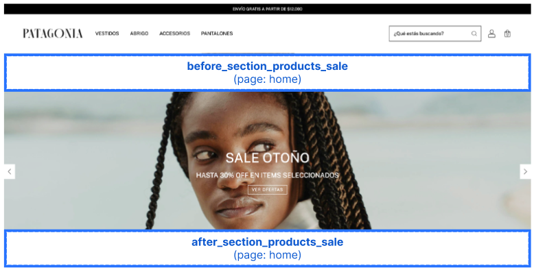
| before_section_products_sale | home |
| after_section_products_sale | home |
| before_section_products_new | home |
| after_section_products_new | home |
| before_section_products_featured | home |
| after_section_products_featured | home |
| before_section_newsletter | home |
| after_section_newsletter | home |
| before_register_form | register |
| after_register_form | register |
| before_register_form_fields | register |
| after_register_form_fields | register |
| before_register_form_submit | register |
| after_register_form_submit | register |
Slots Not Available in All Sections
Some groups ot slots are not available across every theme. The table below shows coverage for these slots.
| quick_buy | products_sale | products_new | newsletter | |
|---|---|---|---|---|
| amazonas | No | Yes | Yes | Yes |
| bahia | No | Yes | Yes | No |
| baires | No | Yes | Yes | Yes |
| brasilia | No | Yes | Yes | Yes |
| cali | No | Yes | Yes | Yes |
| cubo | No | Yes | Yes | No |
| guadalajara | No | Yes | Yes | Yes |
| lima | No | Yes | Yes | Yes |
| morelia | No | Yes | Yes | Yes |
| recife | No | Yes | Yes | Yes |
| toluca | No | Yes | Yes | Yes |
| uyuni | No | Yes | Yes | Yes |
| luxury | No | Yes | Yes | No |
| rio | No | Yes | Yes | Yes |
| atlantico | No | Yes | No | No |
| zen | No | Yes | No | No |
| base | No | No | No | No |
| idea | No | No | No | Yes |
| material | No | No | No | Yes |
| new_linkedman | No | Yes | No | No |
| patagonia | Yes | Yes | Yes | Yes |
Slot Visual Reference
Home, Category, and Search Pages
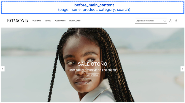
before_main_content
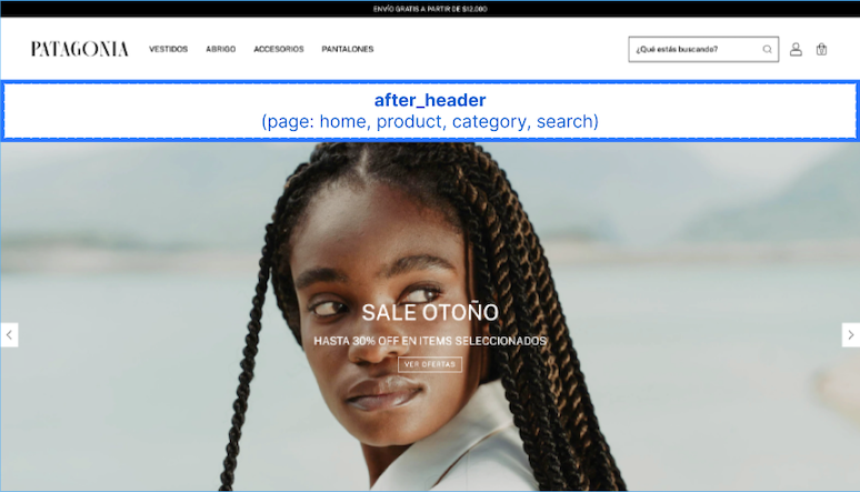
after_header
Important
On the Patagonia theme, merchants can enable a transparent header option. When this setting is active, the after_header slot is hidden and will not be rendered.
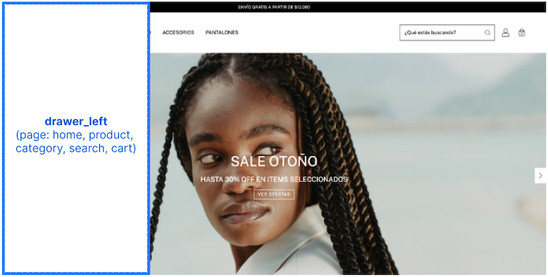
drawer_left
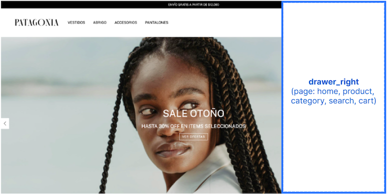
drawer_right
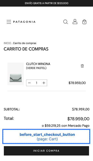
before_go_to_checkout
Home Page Section Slots
The home page is composed of stackable sections. These slots let you inject content immediately before or after a product section, so your content flows with the page layout instead of overlapping existing content.
Each slot is available only on the home page and is rendered only when its corresponding section is present in the merchant's home layout. If the merchant has not added that section to their home page, the related slots will not render.
Sale Products Section
before_section_products_saleafter_section_products_sale
import type { NubeSDK } from "@tiendanube/nube-sdk-types";
import { Box, Text } from "@tiendanube/nube-sdk-jsx";

export function App(nube: NubeSDK) {
  nube.render("before_section_products_sale", [
    <Box key="sale-banner">
      <Text>🔥 Limited-time deals — up to 50% off!</Text>
    </Box>,
  ]);
}
New Products Section
before_section_products_newafter_section_products_new
These slots inject content immediately before or after the new products section on the home page.
import type { NubeSDK } from "@tiendanube/nube-sdk-types";
import { Box, Text } from "@tiendanube/nube-sdk-jsx";

export function App(nube: NubeSDK) {
  nube.render("before_section_products_new", [
    <Box key="new-banner">
      <Text>✨ Just landed — check out our latest arrivals!</Text>
    </Box>,
  ]);
}
Featured Products Section
before_section_products_featuredafter_section_products_featured
These slots inject content immediately before or after the featured products section on the home page.
import type { NubeSDK } from "@tiendanube/nube-sdk-types";
import { Box, Text } from "@tiendanube/nube-sdk-jsx";

export function App(nube: NubeSDK) {
  nube.render("before_section_products_featured", [
    <Box key="featured-banner">
      <Text>⭐ Handpicked favorites, just for you.</Text>
    </Box>,
  ]);
}
Newsletter Section
before_section_newsletterafter_section_newsletter
These slots inject content immediately before or after the newsletter section on the home page.
import type { NubeSDK } from "@tiendanube/nube-sdk-types";
import { Box, Text } from "@tiendanube/nube-sdk-jsx";

export function App(nube: NubeSDK) {
  nube.render("before_section_newsletter", [
    <Box key="newsletter-banner">
      <Text>📬 Subscribe and get 10% off your first order!</Text>
    </Box>,
  ]);
}
Product Grid Slots
Product grid slots are special slots that allow you to render components on product cards within product grids. These slots include:
product_grid_item_image_top_leftproduct_grid_item_image_top_rightproduct_grid_item_image_bottom_leftproduct_grid_item_image_bottom_rightbefore_product_grid_item_nameafter_product_grid_item_namebefore_product_grid_item_priceafter_product_grid_item_price
Rendering Components in Product Grids
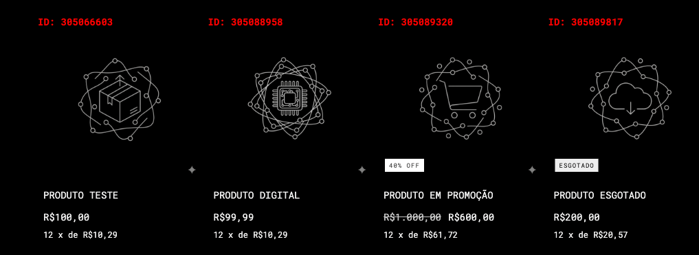
To render components in product grids, return an array of components where the root element for each product includes the key prop set to that product's ID. This allows your app to render components across multiple items in the grid.
import { Text } from "@tiendanube/nube-sdk-jsx";
import type { NubeSDK } from "@tiendanube/nube-sdk-types";

export function App(nube: NubeSDK) {
  const productIds = [1, 2, 3];
  nube.render("product_grid_item_image_top_left", () => {
    return productIds.map((id) => <Text key={id}>ID: {id.toString()}</Text>);
  });
}
For a complete example of rendering components dynamically in product grids, see the Dynamic Product Grid Rendering section below:
Product Page Slots
before_product_detail_nameafter_product_detail_namebefore_product_detail_priceafter_product_detail_pricebefore_product_detail_payment_optionsafter_product_detail_payment_optionsbefore_product_detail_shipping_optionsafter_product_detail_shipping_optionsbefore_product_detail_add_to_cartafter_product_detail_add_to_cartbefore_product_detail_related_productsafter_product_detail_related_productsbefore_product_detail_complementary_productsafter_product_detail_complementary_products
before_product_detail_price
after_product_detail_price
before_product_detail_payment_options
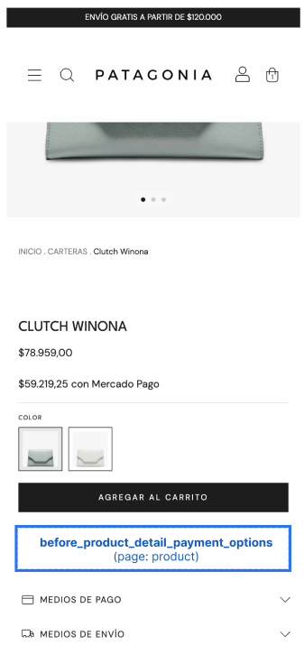
after_product_detail_payment_options
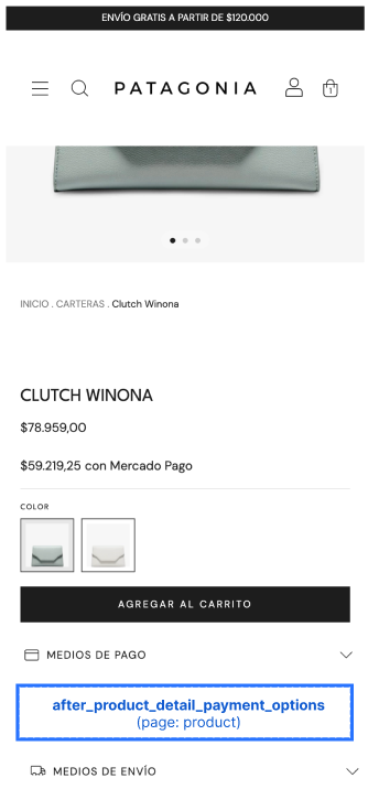
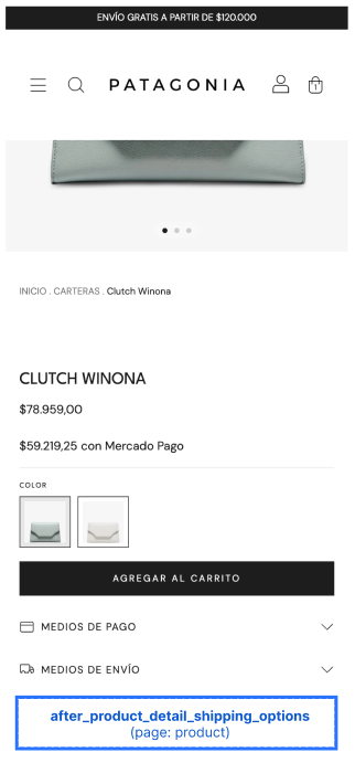
before_product_detail_shipping_options
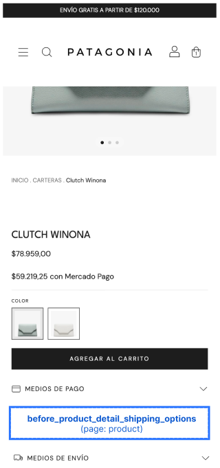
after_product_detail_shipping_options
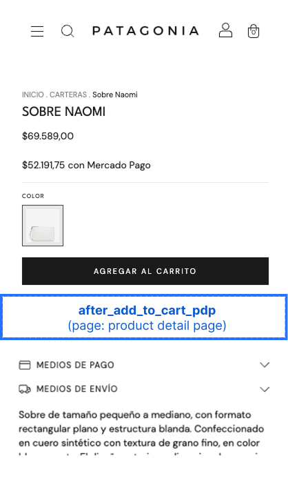
before_product_detail_add_to_cart
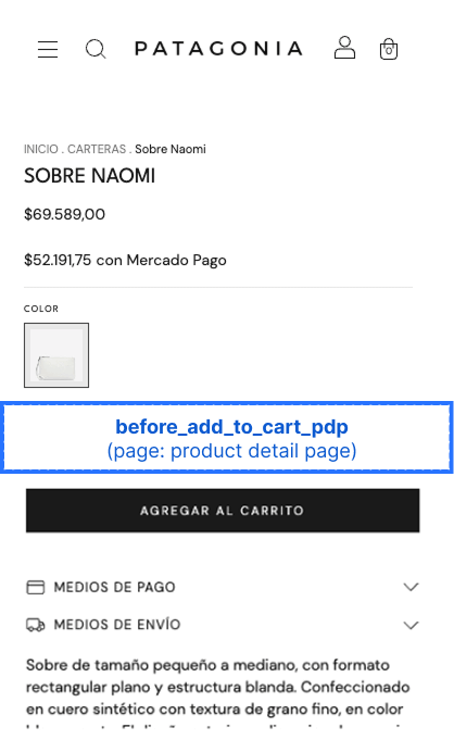
after_product_detail_add_to_cart
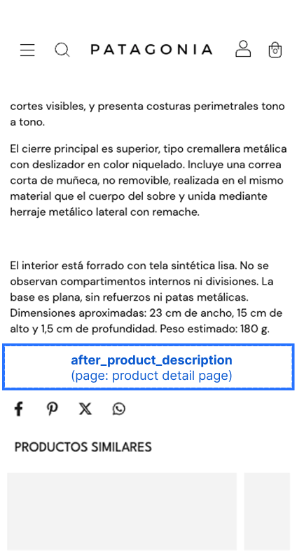
after_product_description
Product Detail Section Slots
The product detail page can include product-list sections such as related products and complementary products. These slots let you inject content immediately before or after those sections, so your content flows with the page layout instead of overlapping existing content.
Like the home page section slots, each slot is rendered only when its corresponding section is present on the merchant's product page. If the theme or product does not display that section, the related slots will not render.
Related Products Section
before_product_detail_related_productsafter_product_detail_related_products
These slots inject content immediately before or after the related products section on the product detail page.
import type { NubeSDK } from "@tiendanube/nube-sdk-types";
import { Box, Text } from "@tiendanube/nube-sdk-jsx";

export function App(nube: NubeSDK) {
  nube.render("before_product_detail_related_products", [
    <Box key="related-heading">
      <Text>You might also like</Text>
    </Box>,
  ]);
}
Complementary Products Section
before_product_detail_complementary_productsafter_product_detail_complementary_products
These slots inject content immediately before or after the complementary products section on the product detail page.
import type { NubeSDK } from "@tiendanube/nube-sdk-types";
import { Box, Text } from "@tiendanube/nube-sdk-jsx";

export function App(nube: NubeSDK) {
  nube.render("after_product_detail_complementary_products", [
    <Box key="complementary-note">
      <Text>Complete the look with these picks.</Text>
    </Box>,
  ]);
}
Cart Page Slots
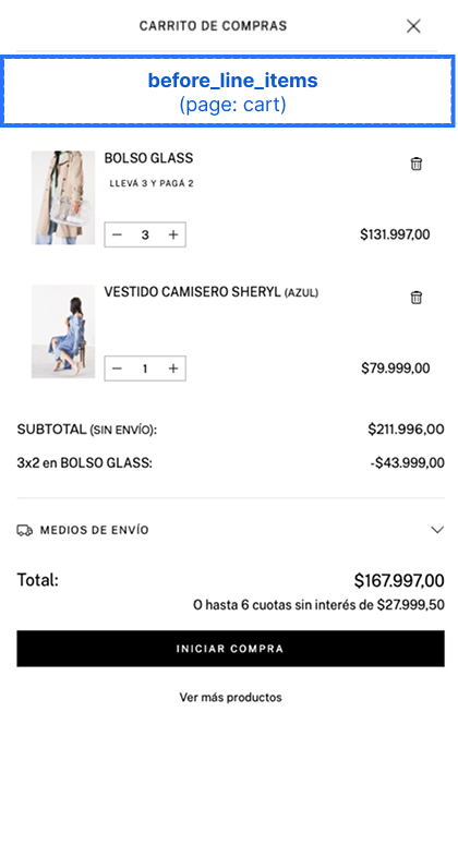
before_line_items
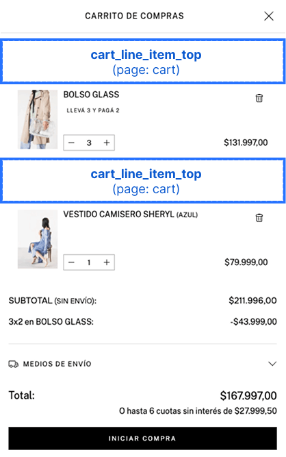
before_line_item
The key prop must be set to the line item's ID for each component.
export function App(nube: NubeSDK) {
  nube.render("before_line_item", (state) => {
    return state.cart.items.map((item) => <Text key={item.id}>Content</Text>);
  });
}
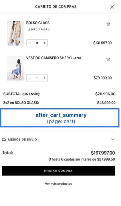
after_cart_summary
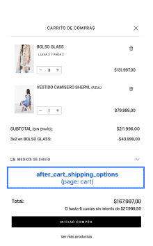
after_go_to_checkout
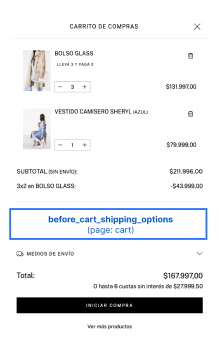
before_cart_shipping_options
Renders immediately before the shipping options on the cart page.
after_cart_shipping_options
Renders immediately after the shipping options on the cart page.
import type { NubeSDK } from "@tiendanube/nube-sdk-types";
import { Box, Text } from "@tiendanube/nube-sdk-jsx";

export function App(nube: NubeSDK) {
  nube.render("after_cart_shipping_options", [
    <Box key="shipping-note">
      <Text>Free shipping on orders over $50.</Text>
    </Box>,
  ]);
}
Register Page Slots
before_register_formafter_register_formbefore_register_form_fieldsafter_register_form_fieldsbefore_register_form_submitafter_register_form_submit
These slots are available on the storefront register page, where customers create a new account. Use them to inject custom content around the registration form, its fields, or its submit button.
The before_register_form and after_register_form slots wrap the entire form, while the remaining slots let you target more specific areas: around the group of form fields, or around the submit button.
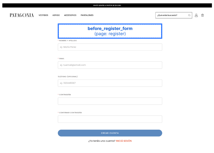
before_register_form
Renders immediately before the registration form.
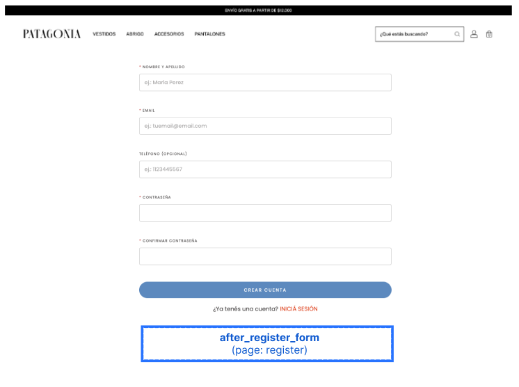
after_register_form
Renders immediately after the registration form.
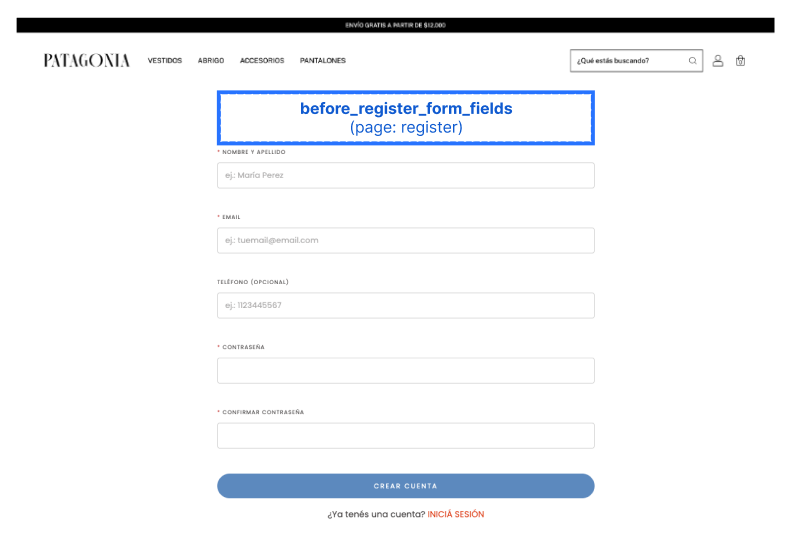
before_register_form_fields
Renders inside the form, immediately before the registration fields.
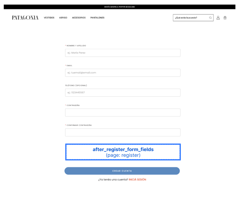
after_register_form_fields
Renders inside the form, immediately after the registration fields (and before the submit button).
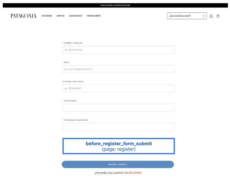
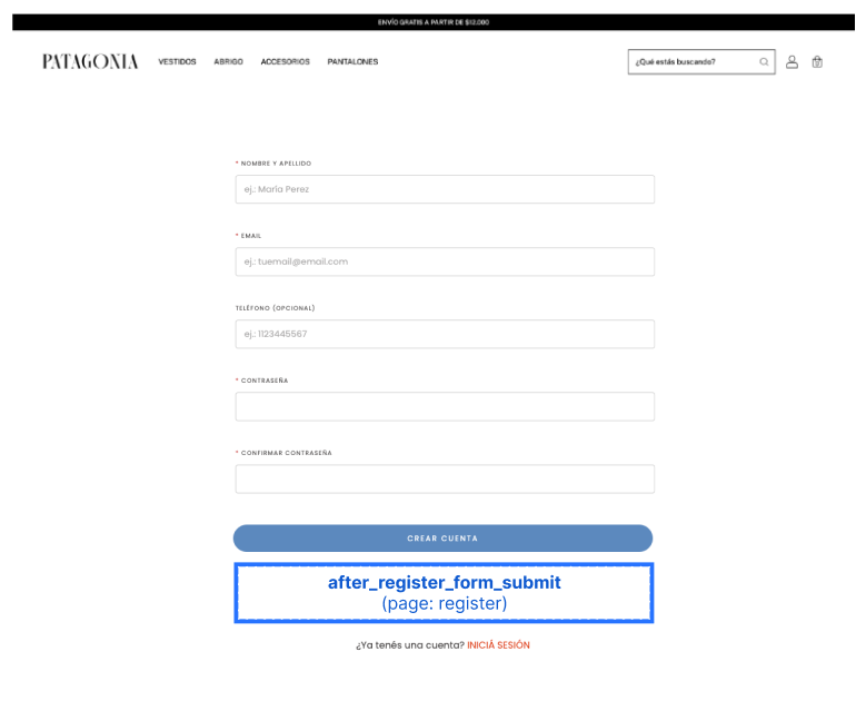
before_register_form_submit
Renders inside the form, immediately before the submit button.
after_register_form_submit
Renders inside the form, immediately after the submit button.
import type { NubeSDK } from "@tiendanube/nube-sdk-types";
import { Box, Text } from "@tiendanube/nube-sdk-jsx";

export function App(nube: NubeSDK) {
  nube.render("after_register_form_fields", [
    <Box key="register-terms">
      <Text>By creating an account you agree to our terms and conditions.</Text>
    </Box>,
  ]);
}
Footer Slots
These slots let you inject content around and inside the storefront footer.
before_footerafter_footerinside_footerfooter_seals
The before_footer and after_footer slots wrap the footer from the outside, while inside_footer and footer_seals let you target areas within the footer itself. Each slot is detailed below.
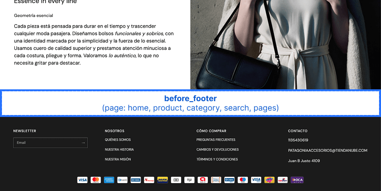
before_footer
Renders immediately before the footer.
import type { NubeSDK } from "@tiendanube/nube-sdk-types";
import { Box, Text } from "@tiendanube/nube-sdk-jsx";

export function App(nube: NubeSDK) {
  nube.render("before_footer", [
    <Box key="before-footer-banner">
      <Text>Sign up for our newsletter and get 10% off.</Text>
    </Box>,
  ]);
}
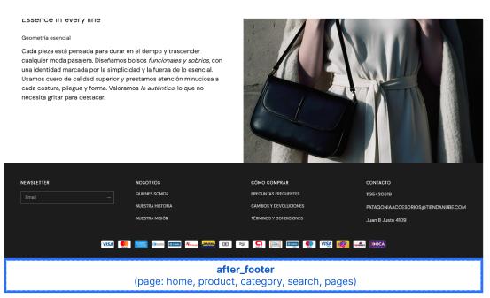
after_footer
Renders immediately after the footer.
import type { NubeSDK } from "@tiendanube/nube-sdk-types";
import { Box, Text } from "@tiendanube/nube-sdk-jsx";

export function App(nube: NubeSDK) {
  nube.render("after_footer", [
    <Box key="after-footer-banner">
      <Text>© 2025 — All rights reserved.</Text>
    </Box>,
  ]);
}
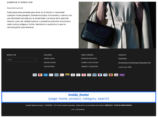
inside_footer
Renders inside the footer, alongside its existing content.
import type { NubeSDK } from "@tiendanube/nube-sdk-types";
import { Box, Text } from "@tiendanube/nube-sdk-jsx";

export function App(nube: NubeSDK) {
  nube.render("inside_footer", [
    <Box key="footer-note">
      <Text>Follow us on social media for exclusive offers.</Text>
    </Box>,
  ]);
}
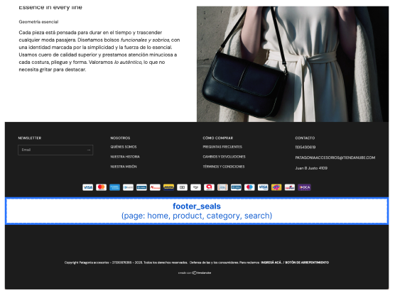
footer_seals
Renders inside the footer's seals area.
Important
This slot is only available when the store has configured seals that are set to be visible. If the store has no visible seals, the footer_seals slot is not rendered.
import type { NubeSDK } from "@tiendanube/nube-sdk-types";
import { Box, Text } from "@tiendanube/nube-sdk-jsx";

export function App(nube: NubeSDK) {
  nube.render("footer_seals", [
    <Box key="custom-seal">
      <Text>Secure checkout guaranteed.</Text>
    </Box>,
  ]);
}
Examples
Adding Content to Product Page
import type { NubeSDK } from "@tiendanube/nube-sdk-types";
import { Box, Text } from "@tiendanube/nube-sdk-jsx";

export function App(nube: NubeSDK) {
  nube.render("after_product_detail_name", [
    <Box key="product-badge">
      <Text>Free Shipping Available!</Text>
    </Box>,
  ]);
}
Adding Content Before Add to Cart
import type { NubeSDK } from "@tiendanube/nube-sdk-types";
import { Box, Text } from "@tiendanube/nube-sdk-jsx";

export function App(nube: NubeSDK) {
  nube.render("before_product_detail_add_to_cart", [
    <Box key="size-guide">
      <Text>View Size Guide</Text>
    </Box>,
  ]);
}
Adding Content Around Payment Options
import type { NubeSDK } from "@tiendanube/nube-sdk-types";
import { Box, Text } from "@tiendanube/nube-sdk-jsx";

export function App(nube: NubeSDK) {
  nube.render("before_product_detail_payment_options", [
    <Box key="payment-banner">
      <Text>Up to 12 interest-free installments available.</Text>
    </Box>,
  ]);
}
Adding Content Around the Register Form
import type { NubeSDK } from "@tiendanube/nube-sdk-types";
import { Box, Text } from "@tiendanube/nube-sdk-jsx";

export function App(nube: NubeSDK) {
  nube.render("before_register_form", [
    <Box key="register-promo">
      <Text>Create an account to track your orders and earn rewards.</Text>
    </Box>,
  ]);
}
Adding Content to Cart Page
import type { NubeSDK } from "@tiendanube/nube-sdk-types";
import { Box, Text } from "@tiendanube/nube-sdk-jsx";

export function App(nube: NubeSDK) {
  nube.render("after_cart_summary", [
    <Box key="cart-promo">
      <Text>Add $50 more for free shipping!</Text>
    </Box>,
  ]);
}
Dynamic Product Grid Rendering
import { Text } from "@tiendanube/nube-sdk-jsx";
import type { NubeSDK, ProductDetails } from "@tiendanube/nube-sdk-types";
import { styled } from "@tiendanube/nube-sdk-ui";

const StyledText = styled(Text)`
  color: red;
  font-weight: bold;
`;

export function App(nube: NubeSDK) {
  const state = nube.getState();

  if (state.location.page.type === "home") {
    const sections = state.location.page.data?.sections || [];
    const allProducts = sections.reduce((acc: ProductDetails[], section) => {
      if (section?.products && Array.isArray(section.products)) {
        acc.push(...section.products);
      }
      return acc;
    }, []);

    nube.render("product_grid_item_image_top_left", () => {
      return allProducts.map((product) => (
        <StyledText key={product.id}>ID: {product.id.toString()}</StyledText>
      ));
    });
  }
}
This is a Dynamic Product Grid Rendering example that displays a styled badge on the top-left corner of each product image in the home page grid.
const sections = state.location.page.data?.sections || [];
const allProducts = sections.reduce((acc: ProductDetails[], section) => {
  if (section?.products && Array.isArray(section.products)) {
    acc.push(...section.products);
  }
  return acc;
}, []);
The previous code flattens all products from all sections into a single array.
nube.render("product_grid_item_image_top_left", () => {
  return allProducts.map((product) => (
    <StyledText key={product.id}>ID: {product.id.toString()}</StyledText>
  ));
});
Then, to understand the slot rendering, key={product.id} is required. Links each rendered element to its corresponding product card.
Deprecated Slot Aliases
Some slot names have been renamed for consistency. The old names still work — the SDK automatically redirects them to the new name at runtime — but they are deprecated and may be removed in a future major version.
We recommend updating your code to use the new slot names as soon as possible. The deprecated aliases will continue to work for now, but they may stop working in a future release.
| Deprecated name | Use instead |
|---|---|
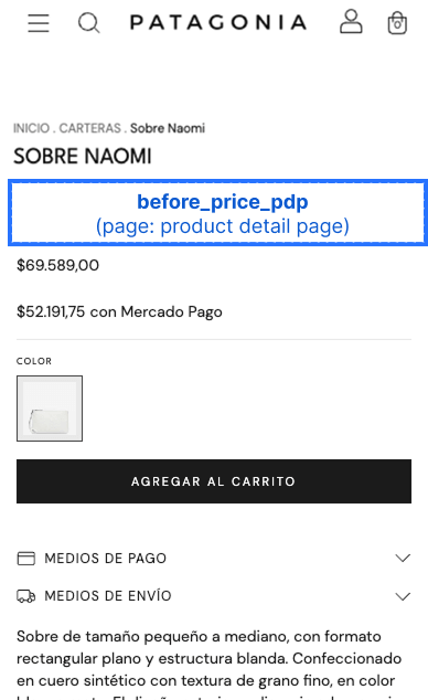
before_price_pdp | before_product_detail_price |
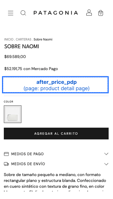
after_price_pdp | after_product_detail_price |
before_add_to_cart_pdp | before_product_detail_add_to_cart |
after_add_to_cart_pdp | after_product_detail_add_to_cart |
cart_line_item_top | before_line_item |
before_start_checkout_button | before_go_to_checkout |
If your app uses both the deprecated name and the new name for the same slot, the new name takes precedence and the deprecated entry is ignored.
Best Practices
- Always use the product's ID as the
keyprop when rendering in product grid slots - Test your components on multiple themes to ensure consistent compatibility
- Consider the visual impact of your components on the storefront design
- Use responsive design principles for components that appear on different screen sizes
- Clear slots when they're no longer needed using
nube.clearSlot()
Help us improve NubeSDK
Found an issue or have a suggestion? Let us know on GitHub.