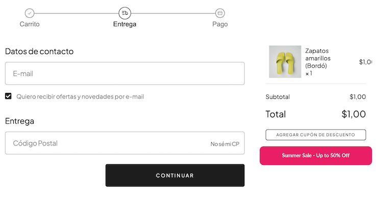
Image
Used to display images. It supports properties such as src, alt, width, height, and responsive sources for different screen sizes.
Usage
import type { NubeSDK } from "@tiendanube/nube-sdk-types";
import { Image, Box } from "@tiendanube/nube-sdk-jsx";

function MyComponent() {
  return (
    <Box direction="col" gap={16}>
      {/* Basic image */}
      <Image
        src="https://app-insti-cdn.nuvemshop.com.br/site/dist/images/widgets/closing-cta/image-3.webp"
        alt="Nuvemshop Logo"
      />
    </Box>
  );
}

export function App(nube: NubeSDK) {
  nube.send("ui:slot:set", () => ({
    ui: {
      slots: {
        after_line_items: <MyComponent />,
      },
    },
  }));
}
Responsive Images with Multiple Sources
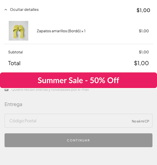
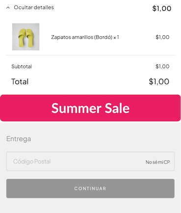
The Image component supports multiple sources with media queries, allowing you to serve different images based on screen size. This is particularly useful for banners and responsive layouts where you want to optimize the image for different devices.
When you provide the sources prop, the component renders a <picture> element with multiple <source> tags, enabling the browser to select the most appropriate image based on the viewport width.
Desktop

Tablet

Mobile

import type { NubeSDK } from "@tiendanube/nube-sdk-types";
import { Image, Box } from "@tiendanube/nube-sdk-jsx";

function ResponsiveBanner() {
  return (
    <Box direction="col" gap={16}>
      <Image
        src="https://placehold.co/400x60/e91e63/white?text=Summer+Sale"
        alt="Promotional banner"
        sources={[
          {
            src: "https://placehold.co/1200x200/e91e63/white?text=Summer+Sale+-+Up+to+50%25+Off",
            media: "(min-width: 768px)",
          },
          {
            src: "https://placehold.co/800x150/e91e63/white?text=Summer+Sale+-+50%25+Off",
            media: "(min-width: 480px)",
          },
        ]}
        style={{ width: "100%", borderRadius: "8px" }}
      />
    </Box>
  );
}

export function App(nube: NubeSDK) {
  nube.send("ui:slot:set", () => ({
    ui: {
      slots: {
        after_line_items: <ResponsiveBanner />,
      },
    },
  }));
}
The browser evaluates the media queries in the sources array from top to bottom and uses the first matching source. The src prop serves as the fallback image when no media query matches or for browsers that don't support the picture element.
Properties
| Property | Type | Required | Description |
|---|---|---|---|
| src | string | Yes | URL of the image to display. Must use "https://". |
| alt | string | Yes | Alternative text for the image, used for accessibility. |
| sources | ImageSource[] | No | Array of alternative image sources with optional media queries. |
| width | Size | No | Width of the image (e.g., "100px", "50%", "auto", 100). |
| height | Size | No | Height of the image (same format as width). |
| id | string | No | Optional unique identifier for the component. |
| style | StyleSheet | No | Custom styles for the image. |
ImageSource
| Property | Type | Required | Description |
|---|---|---|---|
| src | string | Yes | The alternative image source URL (https only). |
| media | string | No | Optional media query to match this source. |
Help us improve NubeSDK
Found an issue or have a suggestion? Let us know on GitHub.